| . : News : . | . : Message of the Week : . |
You are currently viewing an archive of the Wilderness Guardians clan's IPB1 forums.
These forums were used by WG from 2008 to 2011, and now exist for historical and achival purposes only. For the clan's current forums, CLICK HERE. |
"You are a Wilderness Guardian. That northern wasteland; that land of blood, desolation and death is your dominion. Tonight we are going home." ~His Lordship |
|---|---|---|
| War Alert: OFF | Raid Alert: OFF | |
PM a WG Official |
||
Posted: March 20, 2008 01:48 am  | |||||
      IRC Nickname: Gibble00 Group: Emeritus Posts: 775 Member No.: 100 Joined: January 3, 2008 Total Events Attended: 9    | So I've started getting into the signature scene myself, the first one I did was the GTA IV one that you've been seeing in my sig for the past couple of weeks. Of course that was nothing but a cropped screenshot and some animated text. Here are three more to show: J Dilla: I love this one, took me a while. This is my only new animated one.  Edit: On the right, the lighting is sharp and needs blending; it's not supposed to look like that. I think it happened when I flattened the image so that it could be in .gif format. Edit 2: Tried fixing it, dunno if I can, whenever I upload it to photobucket it gets like that. The image isn't like that when I open it. RZA: Simple. My second one after the GTA sig, so doing the background and such was new to me.  TV on the Radio: This was a quicky, I found the image on the web, gave it a border, and rendered the text off of their album cover. The band was on this background, which I thought was pretty wild so I left it.  --------------------  | ||||
Posted: March 20, 2008 03:18 am | |||||
 IRC Nickname: General199 Group: Ex-Member Posts: 1073 Member No.: 318 Joined: March 11, 2008 Total Events Attended: 0 | Love the Dilla and RZA sigs just because of who they are  --------------------  | ||||
Posted: March 20, 2008 09:04 pm | |||||
| IRC Nickname: Fire Lion Sword Group: Emeritus Posts: 1189 Member No.: 103 Joined: January 4, 2008 Total Events Attended: 3 | Never heard of them. lol Pretty good, Gib. That J Dilla one is pretty clean for one of your first attempts. The spacing was done well, and the colors match well. There's still a few more tricks you can do to make it look better, but I'm sure you'll pick them up as you go along. Excellent job, though. -------------------- --------- 獅の炎 ---------- 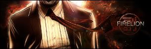 ----------- 忍☯者 ----------- | ||||
Posted: March 20, 2008 11:44 pm | |||||
| IRC Nickname: Gibble00 Group: Emeritus Posts: 775 Member No.: 100 Joined: January 3, 2008 Total Events Attended: 9 |
Thanks  I'm always open to suggestions   -------------------- | ||||
Posted: March 21, 2008 04:36 am | |||||
| IRC Nickname: Fire Lion Sword Group: Emeritus Posts: 1189 Member No.: 103 Joined: January 4, 2008 Total Events Attended: 3 |
1) Remember to add some sort of border. (You've probably already realized this, but I'm just reminding you anyway) 2) Try not to have an unnecessary amount of unused space. If it's intentionally supposed to be half empty (empty, meaning basically zero content -- sort of like my current sig), then it's fine... But otherwise, just choose a reasonable size; not too big, not too small. Nothing special... But a little reiteration never hurts.  -------------------- --------- 獅の炎 ---------- ----------- 忍☯者 ----------- | ||||
 Signature Explosion