| . : News : . | . : Message of the Week : . |
You are currently viewing an archive of the Wilderness Guardians clan's IPB1 forums.
These forums were used by WG from 2008 to 2011, and now exist for historical and achival purposes only. For the clan's current forums, CLICK HERE. |
"You are a Wilderness Guardian. That northern wasteland; that land of blood, desolation and death is your dominion. Tonight we are going home." ~His Lordship |
|---|---|---|
| War Alert: OFF | Raid Alert: OFF | |
PM a WG Official |
||
Posted: March 29, 2011 07:22 pm  | |||||
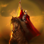
      IRC Nickname: His Lordship Group: Founder Posts: 6029 Member No.: 1 Joined: December 26, 2007 Total Events Attended: 129    | Probably the best WG Artwork I've ever done. Here's the background.
And after I put in the characters, massive difference. After eight hours, you get this:
--------------------  | ||||
Posted: March 29, 2011 07:29 pm | |||||
| IRC Nickname: ZurvivorMan Group: Emeritus Posts: 1098 Member No.: 1528 Joined: December 6, 2008 Total Events Attended: 99 | Love it, good work! -------------------- You don't have to feel like a waste of space You're original, cannot be replaced If you only knew what the future holds After a hurricane comes a rainbow Maybe you're reason why all the doors are closed So you can open one that leads you to the perfect road  | ||||
Posted: March 29, 2011 07:51 pm | |||||
 IRC Nickname: Group: Raid Leader Posts: 1110 Member No.: 2430 Joined: October 14, 2010 Total Events Attended: 77 | Great Work GoodLuck! -------------------- | ||||
Posted: March 29, 2011 08:47 pm | |||||
 IRC Nickname: Renoldojr10 Group: Ex-Member Posts: 215 Member No.: 1553 Joined: December 14, 2008 Total Events Attended: 7 | That's hot stuff, great work. -------------------- When anyone tells me I can't do anything, I'm just not listening any more. I don't scratch my head unless it itches and I don't dance unless I hear some music. I will not be intimidated. That's just the way it is. | ||||
Posted: March 30, 2011 01:23 am | |||||
 IRC Nickname: Mark`` Group: Clan Friend Posts: 2190 Member No.: 2320 Joined: July 15, 2010 Total Events Attended: 208 | May i ask where you got 'The Legendary Warring Clan' from? And have you ever thought about blending/smearing the bold colors to make it look that little bit more realistic? I'm imagining it'd take a while. -------------------- Be sure to check out the Community Events Forum!   | ||||
Posted: March 30, 2011 02:10 am | |||||
| IRC Nickname: His Lordship Group: Founder Posts: 6029 Member No.: 1 Joined: December 26, 2007 Total Events Attended: 129 | Yeah I could do all that, and I could add shadows too, but I deliberately exclude all that to give my art a distinct style. Unmistakeably His Lordship. "The legendary warring clan" was a title bestowed on us by a few RSC members back in 2006 and I want to use it as our tag line. -------------------- | ||||
Posted: March 30, 2011 02:29 am | |||||
 IRC Nickname: Lefty Group: Emeritus Posts: 3340 Member No.: 1055 Joined: June 30, 2008 Total Events Attended: 211 | While I understand the reason for blurring the background, it seems a bit much, especially with the volcano. I always have loved what you do with the characters. I recognize a few from past videos.  Regardless, I think you did a great job. Regardless, I think you did a great job. --------------------      | ||||
Posted: March 31, 2011 03:42 am | |||||
 IRC Nickname: Samurai-JM Group: Emeritus Posts: 3204 Member No.: 117 Joined: January 11, 2008 Total Events Attended: 8 | LOVE IT, except for the text. sharp text on blurry mountains = makes no sense -------------------- -=}¤- Vi Veri Veniversum Vivus Vici -¤{=-  W I N N I N G | ||||
Posted: March 31, 2011 05:42 am | |||||
| IRC Nickname: WizardOfGod Group: Banned Posts: 808 Member No.: 2429 Joined: October 13, 2010 Total Events Attended: 40 | Vnice lordy, you sir are a leg. --------------------  Finally the #1 fisher in WG :) Wilderness Guardian's Top Fighters F2P Safe- Levylov F2P Dangerous- Levylov P2P Hybridding- Ching P2P Dangerous- Ching P2P Safe- Levylov Wanna take these ranks down join the 1v1 ladder! http://www.wildernessguardians.com/forum/i...showtopic=22029 | ||||
Posted: April 7, 2011 11:55 pm | |||||
| IRC Nickname: Masamune39 Group: Ex-Member Posts: 164 Member No.: 2276 Joined: May 29, 2010 Total Events Attended: 8 | I just jizzed. Great job, Gene. You're a damn talented person, man. --------------------
| ||||
Posted: April 8, 2011 04:53 am | |||||
 IRC Nickname: Zooby Group: Guest Posts: 1669 Member No.: 1464 Joined: November 12, 2008 Total Events Attended: 109 | Its good  -------------------- A Revolution without dance is a Revolution not worth having at all Lightbulbs die my sweet, I will depart | ||||
Posted: April 20, 2011 02:31 pm | |||||
 IRC Nickname: Colin Group: Ex-Member Posts: 2039 Member No.: 68 Joined: December 31, 2007 Total Events Attended: 69 | Wow, this is very good. I like it. Keep it up, Gene! --------------------   Proud WG member from January 2006 - Fall 2009 | ||||
Posted: April 27, 2011 05:48 am | |||||
| IRC Nickname: Nonchalant Group: Clan Friend Posts: 23 Member No.: 2431 Joined: October 16, 2010 Total Events Attended: 1 | Lol, posting on a basically dead post... Anyways, I like it. Good use of aerial perspective in your transition from back to foreground. The only place where this strays is the tree in the upper right that sort of looks as though it was added as an afterthought. Not sure if it was intentionally left as clear as it is, but it seems like something to address and keep in mind for future works. The figure in white in the left middle ground of the work seems to be disproportioned with the rest of the figures. It's not really a major problem, but if you're going for realism, this becomes incredibly evident with the tree being placed right next to the figure. Looking back, the perspective on the mid-ground in general seems to be struggling back and forth for an identity. Despite that, the proportions for the foreground and background are great. Good forms and solid chiaroscuro that lends itself well to this style. I'm going to go ahead and disagree with some others on your choice of a crisp font for the text. I personally feel that it contrasts nicely with the rest of the work in a way that, combined with the orthogonals of the foreground figures' arms, draws the viewers eye around the entire piece. Summary: For the most part, I liked it. It'll be interesting to see how you continue developing your style. -------------------- | ||||
Posted: April 28, 2011 07:53 pm | |||||
 IRC Nickname: James|i2ipperz Group: Guardian Posts: 348 Member No.: 2438 Joined: October 25, 2010 Total Events Attended: 46 | i like it gene, only thing which is a tad weird is the bolt coming outta the c'bow looks abit weird idk if im viewing it wrong other than that great work! -------------------- | ||||
Posted: April 30, 2011 11:14 am | |||||
 IRC Nickname: Dog_b2 Group: Guardian Posts: 142 Member No.: 2521 Joined: January 6, 2011 Total Events Attended: 13 | me likey --------------------   | ||||
 My Best Art

