| . : News : . | . : Message of the Week : . |
You are currently viewing an archive of the Wilderness Guardians clan's IPB1 forums.
These forums were used by WG from 2008 to 2011, and now exist for historical and achival purposes only. For the clan's current forums, CLICK HERE. |
"You are a Wilderness Guardian. That northern wasteland; that land of blood, desolation and death is your dominion. Tonight we are going home." ~His Lordship |
|---|---|---|
| War Alert: OFF | Raid Alert: OFF | |
PM a WG Official |
||
Posted: February 4, 2008 06:42 pm  | |||
     IRC Nickname: Group: Banned Posts: 2447 Member No.: 114 Joined: January 8, 2008 Total Events Attended: 149    |   ~~~~~ Okay, I've finally gone back and edited this one. I used the basic sig, then did a lot more to it.  -------------------- | ||
Posted: February 4, 2008 06:43 pm | |||
 IRC Nickname: Yingy Group: Clan Friend Posts: 2205 Member No.: 27 Joined: December 30, 2007 Total Events Attended: 21 | name needs to be bigger  but very nice Signature. -------------------- Friend's Forver The Long Road Ahead - 91/99 Prayer  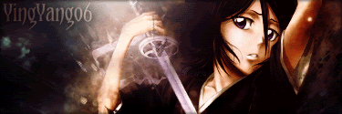 | ||
Posted: February 4, 2008 06:48 pm | |||
| IRC Nickname: Group: Guests Posts: Member No.: 0 Joined: January 1, 1970 Total Events Attended: 1 | For a first attempt it is proffesional art  ; but ya.. Name a bit bigger, and work on some more effects, and it would be a 9/10 or a 10/10 from me.. At this stage I'll give it 7/10 ; but ya.. Name a bit bigger, and work on some more effects, and it would be a 9/10 or a 10/10 from me.. At this stage I'll give it 7/10 -------------------- | ||
Posted: February 4, 2008 07:52 pm | |||
| IRC Nickname: Group: Banned Posts: 2447 Member No.: 114 Joined: January 8, 2008 Total Events Attended: 149 | I put the name small cause idk if I'm ever going to use it. Effects? Um... those will have to wait until I've learned a bit more on all the stupid photoshop things....  -------------------- | ||
Posted: February 4, 2008 08:21 pm | |||
 IRC Nickname: Ranma344 Group: Emeritus Posts: 759 Member No.: 78 Joined: January 1, 2008 Total Events Attended: 24 | looks nice tbh i'd say name bigger yes... but yea... photoshop sucks lol dont use it. use the gimp www.gimp.org it owns 7/8 --------------------  R.I.P. Lucy ! | ||
Posted: February 4, 2008 08:44 pm | |||
 IRC Nickname: Indivi2you Group: Elite Guardian Posts: 5361 Member No.: 43 Joined: December 30, 2007 Total Events Attended: 623 | ohh nice. much better than i can ever make. -------------------- The First, The Last, and the Only ~FLO Never say never, because limits, like fears, are often just an illusion. ~Michael Jordan      | ||
Posted: February 4, 2008 09:32 pm | |||
 IRC Nickname: Ret[Keith] Group: Emeritus Posts: 2049 Member No.: 86 Joined: January 1, 2008 Total Events Attended: 82 | Better than my fail attempts at paint XD GJ  -------------------- Best Firemaker in WG no lie   <--- rofl <--- rofl1st joined WG: October 18th, 2005. Ex-WG mod, OPH winner  ^My original idea (U GOIN DOWN TWIZ)^ 189th person to get "100" firemaking Hash Unit, Tun Unit, C-Unit  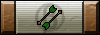  | ||
Posted: February 4, 2008 11:01 pm | |||
 IRC Nickname: Gorgemaster Group: Elite Guardian Posts: 9840 Member No.: 3 Joined: December 26, 2007 Total Events Attended: 540 | Woah very nice for you first attempt Tabs! As the others have said, name needs to be a lot bigger to stand out more and perhaps in a different colour (?). Keep it up  ~George --------------------    | ||
Posted: February 5, 2008 12:03 am | |||
| IRC Nickname: Group: Guests Posts: Member No.: 0 Joined: January 1, 1970 Total Events Attended: 1 | better than i could do lol...but yea, they name is quite small. -------------------- | ||
Posted: February 5, 2008 12:50 am | |||
| IRC Nickname: Group: Banned Posts: 2447 Member No.: 114 Joined: January 8, 2008 Total Events Attended: 149 | The name was just there more to say I made it. This one is different... Went a little crazy messing with different things...  ~~~~ Updated it with suggestions, and a little info from Samurai-JM... Now if only I knew how to make them shiny....  -------------------- | ||
Posted: February 5, 2008 12:51 am | |||
 IRC Nickname: Mr Glennfase Group: Emeritus Posts: 3064 Member No.: 39 Joined: December 30, 2007 Total Events Attended: 220 | cool looking -------------------- That's Mr. Glennfase to you. Ex-Warlord/Council  | ||
Posted: February 5, 2008 01:44 pm | |||
 IRC Nickname: Samurai-JM Group: Emeritus Posts: 3204 Member No.: 117 Joined: January 11, 2008 Total Events Attended: 8 | That's your first? FFS you beat me xD My first was... I don't wanna talk about it... Very nice xD just work on the text(right click text layer and goto blending properties for leet text effects tbh) and you're well on your way to becoming a sig maker O: -------------------- -=}¤- Vi Veri Veniversum Vivus Vici -¤{=-  W I N N I N G | ||
Posted: February 5, 2008 10:03 pm | |||
| IRC Nickname: Group: Banned Posts: 2447 Member No.: 114 Joined: January 8, 2008 Total Events Attended: 149 | I read a guide and was kinda following some of what it said for the angel one... Then added other things with it. The one I'm currently using was totally my own invention! ~~~ Oh, now I see what you mean... Blending properties! -------------------- | ||
Posted: February 5, 2008 10:42 pm | |||
| IRC Nickname: Gorgemaster Group: Elite Guardian Posts: 9840 Member No.: 3 Joined: December 26, 2007 Total Events Attended: 540 | Much much better Tabs (the second purple one). same text but it stands out soo muich better now GJ ~George -------------------- | ||
Posted: February 5, 2008 11:11 pm | |||
 IRC Nickname: Kiwi011 Group: Emeritus Posts: 3052 Member No.: 40 Joined: December 30, 2007 Total Events Attended: 21 | use better text, other than that its amazing. --------------------  | ||
Posted: February 6, 2008 01:58 am | |||
| IRC Nickname: Fire Lion Sword Group: Emeritus Posts: 1189 Member No.: 103 Joined: January 4, 2008 Total Events Attended: 3 | Those are pretty cool for your first attempts. (The first one) It's nice - like something I'd make... But there's an unnecessary amount of unused space. Maybe try adding more text, larger text, more strategetically placed text, or using a smaller overall size for the sig. (The second one) It's a little less smooth than the first one. It may just be hanging on my personal taste, but the overall appearance, although executed correctly, doesn't look too appealing. The text - I forget what the term is called for the text's quality - but try to use the a smoother option. I believe there's a few to choose from: Sharp, smooth, strong, none. (Don't use 'none') Good luck. Keep it up. -------------------- --------- 獅の炎 ---------- 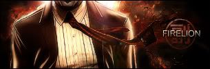 ----------- 忍☯者 ----------- | ||
Posted: February 6, 2008 08:29 pm | |||
| IRC Nickname: Group: Banned Posts: 2447 Member No.: 114 Joined: January 8, 2008 Total Events Attended: 149 |  -------------------- | ||
Posted: February 6, 2008 09:42 pm | |||
| IRC Nickname: Yingy Group: Clan Friend Posts: 2205 Member No.: 27 Joined: December 30, 2007 Total Events Attended: 21 |
I Lol'd, I want it! Lmao. That's Funny and amazing tbh -------------------- Friend's Forver The Long Road Ahead - 91/99 Prayer | ||
Posted: February 6, 2008 11:17 pm | |||
 IRC Nickname: Gibble00 Group: Emeritus Posts: 775 Member No.: 100 Joined: January 3, 2008 Total Events Attended: 9 | Very good. I've been doing some photoshop lately, got it for Christmas, but what I've been doing is original stuff, not sigs or renders or anything, just images from scratch, all greyscale. I'm doing some pieces for my school's literary magazine, that's why they don't have any color. Maybe once I finish some of them I'll get around to posting them. --------------------  | ||
Posted: February 8, 2008 11:02 pm | |||
| IRC Nickname: Group: Guests Posts: Member No.: 0 Joined: January 1, 1970 Total Events Attended: 1 | very nice for first attempt, writing needs different font tbh tho 8/10 (Y) -------------------- | ||
Posted: February 9, 2008 05:18 am | |||
| IRC Nickname: Group: Banned Posts: 2447 Member No.: 114 Joined: January 8, 2008 Total Events Attended: 149 | Was playing around with things, and came up with this. I don't like the render, cause it doesn't match well, but I do love the way the background came out! -------------------- | ||
 1st photoshop effort?