| . : News : . | . : Message of the Week : . |
You are currently viewing an archive of the Wilderness Guardians clan's IPB1 forums.
These forums were used by WG from 2008 to 2011, and now exist for historical and achival purposes only. For the clan's current forums, CLICK HERE. |
"You are a Wilderness Guardian. That northern wasteland; that land of blood, desolation and death is your dominion. Tonight we are going home." ~His Lordship |
|---|---|---|
| War Alert: OFF | Raid Alert: OFF | |
PM a WG Official |
||
Posted: August 24, 2008 06:09 pm  | |
     IRC Nickname: {Rene} Group: Guest Posts: 838 Member No.: 267 Joined: February 25, 2008 Total Events Attended: 55    | Yeah I've been experimenting with photoshop CS2 lately. These are generally pretty basic but if you like one of them feel free to mention it and I can put your name on it and some sub text incase you want it ;P Please note: - For the dante sig, I can remove the text but please tell me if you want the text like Devil May Cry (faded) or Rene (normal) style - If your name is too long it will be put vertically on the dragon sig. - First come first serve Also if you want a costumised font look on Dafont (link below) and link me to the font you want. If you want added subtext mention it aswell. http://www.dafont.com/ Sig  1: 1: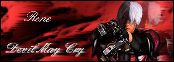 Sig 2: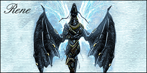 Sig 3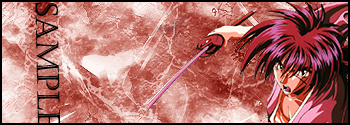 --------------------  |
Posted: August 24, 2008 06:37 pm | |
 IRC Nickname: Samurai-JM Group: Emeritus Posts: 3204 Member No.: 117 Joined: January 11, 2008 Total Events Attended: 8 | 4th is best. -------------------- -=}¤- Vi Veri Veniversum Vivus Vici -¤{=-  W I N N I N G |
Posted: August 24, 2008 06:57 pm | |
| IRC Nickname: Fire Lion Sword Group: Emeritus Posts: 1189 Member No.: 103 Joined: January 4, 2008 Total Events Attended: 3 | Nice! #2 and #3 are the best, and they are only several steps away from looking pro. #1, although it's very similar to #3, it seems a little less fluent. The background is too plain for the intricate detail of the render, especially in the area around the gun he's holding, and the red doesn't match the red of his jacket, so, to me, it seems a little forced. If I were to choose one to use, personally, it would be #2. The background matches well, the text is positioned nicely and the render almost seems like it belongs in the center of the sig. -------------------- --------- 獅の炎 ---------- 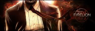 ----------- 忍☯者 ----------- |
Posted: August 25, 2008 12:10 am | |
| IRC Nickname: Group: Banned Posts: 2447 Member No.: 114 Joined: January 8, 2008 Total Events Attended: 149 | I agree with Firelion on the first. Wrong color red. Bring in more details, don't just let it be rather bland. I'd love to see what you could do on the 2nd with a little more work. I'd also like to play with that render myself...  -------------------- |
Posted: August 25, 2008 12:19 am | |
 IRC Nickname: Dilz Group: Banned Posts: 1403 Member No.: 973 Joined: June 23, 2008 Total Events Attended: 151 | Download Metalcx brushes and other grunge brushes. -------------------- 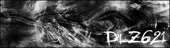 LOLPNS  Perm banned. |
Posted: August 25, 2008 09:44 pm | |
 IRC Nickname: Mickey Group: Emeritus Posts: 5305 Member No.: 48 Joined: December 30, 2007 Total Events Attended: 282 | Pretty good if you ask me. --------------------    |
Posted: October 15, 2008 03:25 am | |
 IRC Nickname: Sativas Group: Elite Guardian Posts: 2255 Member No.: 1305 Joined: August 29, 2008 Total Events Attended: 155 | I like the last one best  --------------------  The Ultimate Skilling and Combat Badges Updated June 17th, 2011      |
Posted: October 15, 2008 03:55 pm | |
| IRC Nickname: Samurai-JM Group: Emeritus Posts: 3204 Member No.: 117 Joined: January 11, 2008 Total Events Attended: 8 | RENEEEE  awesome stuff dude, they definitely got better from 1 -> 3 too, the 3rd is really nice.  numbah 4 isn't bad either, I just wish photoshop didn't make animated sigs so grainy >< -------------------- -=}¤- Vi Veri Veniversum Vivus Vici -¤{=- W I N N I N G |
 Some of my sig attempts =O