| . : News : . | . : Message of the Week : . |
You are currently viewing an archive of the Wilderness Guardians clan's IPB1 forums.
These forums were used by WG from 2008 to 2011, and now exist for historical and achival purposes only. For the clan's current forums, CLICK HERE. |
"You are a Wilderness Guardian. That northern wasteland; that land of blood, desolation and death is your dominion. Tonight we are going home." ~His Lordship |
|---|---|---|
| War Alert: OFF | Raid Alert: OFF | |
PM a WG Official |
||
Posted: September 27, 2008 06:29 am  | |||
      IRC Nickname: Lefty Group: Emeritus Posts: 3340 Member No.: 1055 Joined: June 30, 2008 Total Events Attended: 211    | Well after a good hour or so figuring out how to work Photoshop, reading a few tutorials, and looking for a render, I finally popped out a signature that I am somewhat proud of. Nothing perfect but it is the first time that I have used Photoshop and the first time I have worked with photo manipulation (all of my other signatures have been getting base images and then adding just a set of animations to it). Please post C/C for me along with a rate please.   Oh and that is Sephiroth from Final Fantasy 7. Hopefully I did not mutilate him too bad.  Thanks. --------------------      | ||
Posted: September 27, 2008 06:46 am | |||
 IRC Nickname: Havochaha Group: Ex-Member Posts: 2257 Member No.: 106 Joined: January 5, 2008 Total Events Attended: 113 | thats way too light of an avatar to be sephiroth  other then that i like it a little dull on the background though and the text is eh 6/10 -------------------- Havochaha Perm Banned Oct 1st 2009 Havochaha Unbanned February 13th 2011  http://www.erepublik.com/en/referrer/Omar+Dandan How to Make 10m an Hour | ||
Posted: September 27, 2008 10:42 am | |||
 IRC Nickname: Wayne|Eregion2 Group: Emeritus Posts: 3087 Member No.: 156 Joined: January 25, 2008 Total Events Attended: 8 | Compared to what I could do? Infinity out of 10.  Looks great especially for a first try! Looks great especially for a first try! --------------------  | ||
Posted: September 27, 2008 12:00 pm | |||
 IRC Nickname: Gorgemaster Group: Elite Guardian Posts: 9840 Member No.: 3 Joined: December 26, 2007 Total Events Attended: 540 | 8/10 Very , very nice for a first try. As the others have said, the background could have been a bit more colourful and the text as well is a little small and obscure, make it stand out a bit more next time. Overall well done. Keep it up  --------------------    | ||
Posted: September 27, 2008 01:19 pm | |||
 IRC Nickname: Geofff Group: Clan Friend Posts: 1238 Member No.: 608 Joined: May 12, 2008 Total Events Attended: 96 | Very good for a first try. The border at the bottom right is more transparent than other sides, I think this is because you put the border layer below the render. Text just looks a bit weird; try making it more transparent and put it over his left shoulder or something. Background needs some more blending and it's always useful to use colours which are similar for it. Not black and white  I do like your brushes on your background though, they give a pretty sweet effect. Keep it up --------------------  | ||
Posted: September 27, 2008 03:01 pm | |||
| IRC Nickname: Lefty Group: Emeritus Posts: 3340 Member No.: 1055 Joined: June 30, 2008 Total Events Attended: 211 | Thanks everyone for their comments. They all are valid points and allow me to see what I need to look up and learn next. On the text I was getting to the end of it and a friend of mine really wanted to see it, so I was like "Oh well.. I will do it." I pretty much followed two different tutorials on this combining them when they matched up. A few different effects between the two that I suppose is what made it a little messy. I didn't really blur any because that was something that I was going to save to learn how to do on something else, but I believe I still should have blurred here. Black background was just what was included. White texture is because of a smear. I will try to edit those a bit next time to add the "spice" to it. My skills are all a work in progress.  -------------------- | ||
Posted: September 27, 2008 05:02 pm | |||
 IRC Nickname: Yingy Group: Clan Friend Posts: 2205 Member No.: 27 Joined: December 30, 2007 Total Events Attended: 21 | 9/10 lefty -------------------- Friend's Forver The Long Road Ahead - 91/99 Prayer  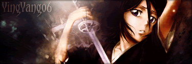 | ||
Posted: September 27, 2008 05:17 pm | |||
 IRC Nickname: Mickey Group: Emeritus Posts: 5305 Member No.: 48 Joined: December 30, 2007 Total Events Attended: 282 | You should save as png, it's a clearer picture format. Other than that, nice job. 8/10. --------------------    | ||
Posted: September 27, 2008 08:31 pm | |||
| IRC Nickname: Sum41xx Group: Emeritus Posts: 630 Member No.: 102 Joined: January 3, 2008 Total Events Attended: 0 |
No it's not. Maybe you mean Jpeg  --------------------   Proud WG member since December 2003 | ||
Posted: September 27, 2008 08:56 pm | |||
 IRC Nickname: Gazza|Pker Group: Ex-Member Posts: 308 Member No.: 159 Joined: January 25, 2008 Total Events Attended: 2 | Nice work 7/10  --------------------   | ||
Posted: September 27, 2008 09:11 pm | |||
 IRC Nickname: Sativas Group: Elite Guardian Posts: 2255 Member No.: 1305 Joined: August 29, 2008 Total Events Attended: 155 | Not only do I love Sephiroth, That is a awesome first sig 8/10. --------------------  The Ultimate Skilling and Combat Badges Updated June 17th, 2011      | ||
Posted: September 27, 2008 09:59 pm | |||
| IRC Nickname: Group: Banned Posts: 2447 Member No.: 114 Joined: January 8, 2008 Total Events Attended: 149 | The double image doesn't work quite right in this one. Some of the white is just a bit bright, maybe use a grey tone? -------------------- | ||
Posted: September 27, 2008 11:59 pm | |||
 IRC Nickname: Samurai-JM Group: Emeritus Posts: 3204 Member No.: 117 Joined: January 11, 2008 Total Events Attended: 8 | Not bad dude. Only parts I don't really like are the reaaaally white parts around his head and the sword, it just distorts his form too much IMO. Otherwise, the depth and color is pretty nice. One of the best first-in-photoshop sigs I've seen in a long time! -------------------- -=}¤- Vi Veri Veniversum Vivus Vici -¤{=-  W I N N I N G | ||
 Ehh.. Comment Please?